I like to take pleasure in the simple things. Mac and cheese is my favourite food, Charlie and the Chocolate Factory is a good read and Dumb and Dumber cheers me up on a rough day. Although most of my days are packed with activity, I love to revel in the quiet as much as one possibly can in a house with two young children who have a knack for running laps around the main living area as if they were Usain Bolt basking in his own greatness.
As far as cards go, simple can be a great thing too. Done right, white space is aesthetically pleasing.
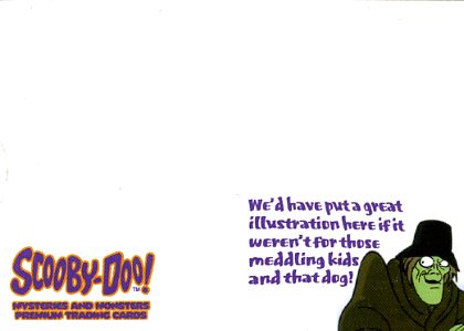
Here’s a card that has some of the most white space I can recall off hand. And I love it:


It comes from 2003 Inkworks Scooby-Doo: Mysteries and Monsters. It was a case topper. I picked it up for a few dollars simply because it made me laugh. I grew up loving (and being scared of) Scooby-Doo and I love cards about cards. This self-referential masterpiece gets them both with hilarious results. Even the back takes the minimalist approach. Clearly, this is an instance where less is more and there’s some complex thought behind its simplicity.


